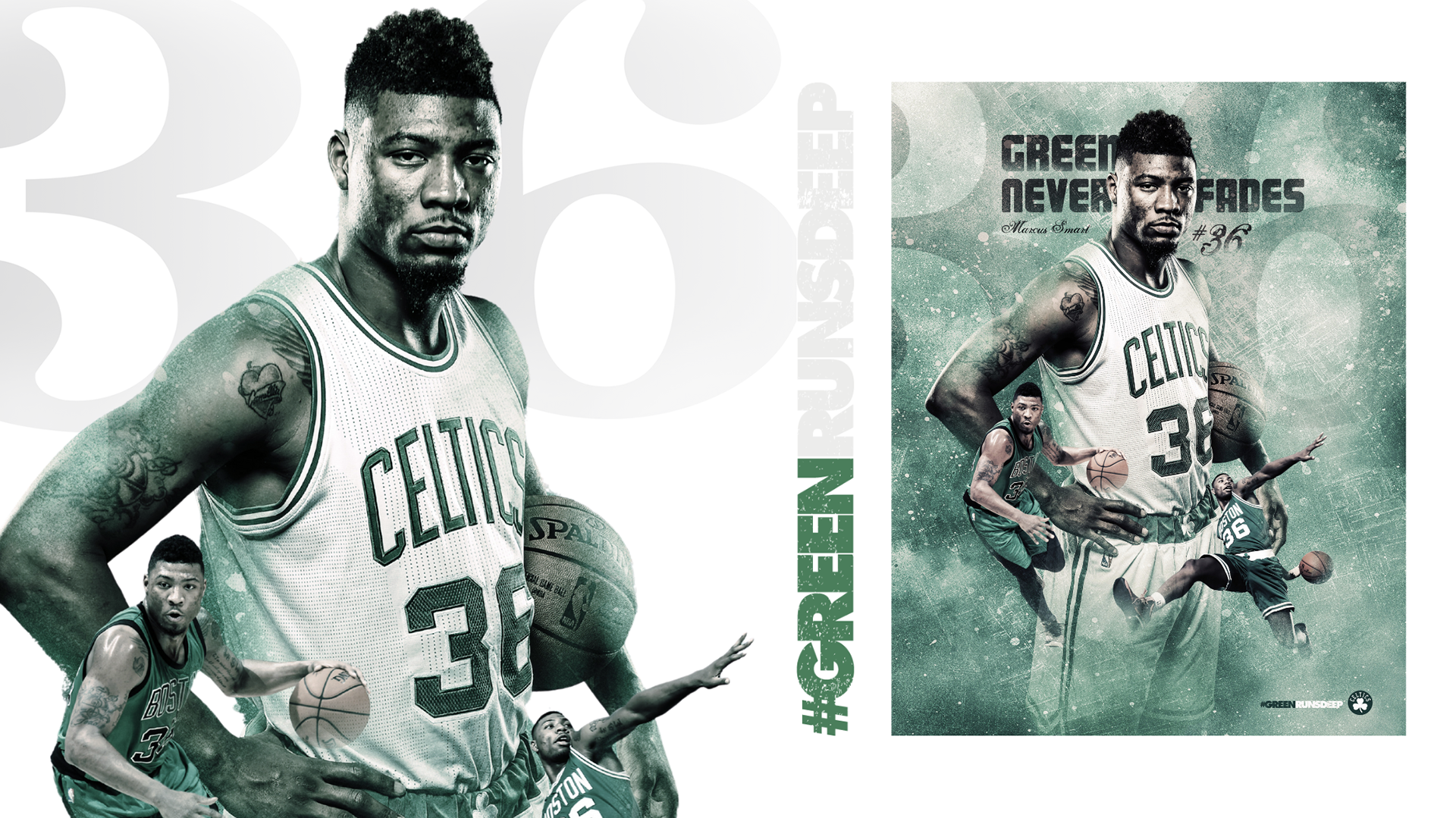

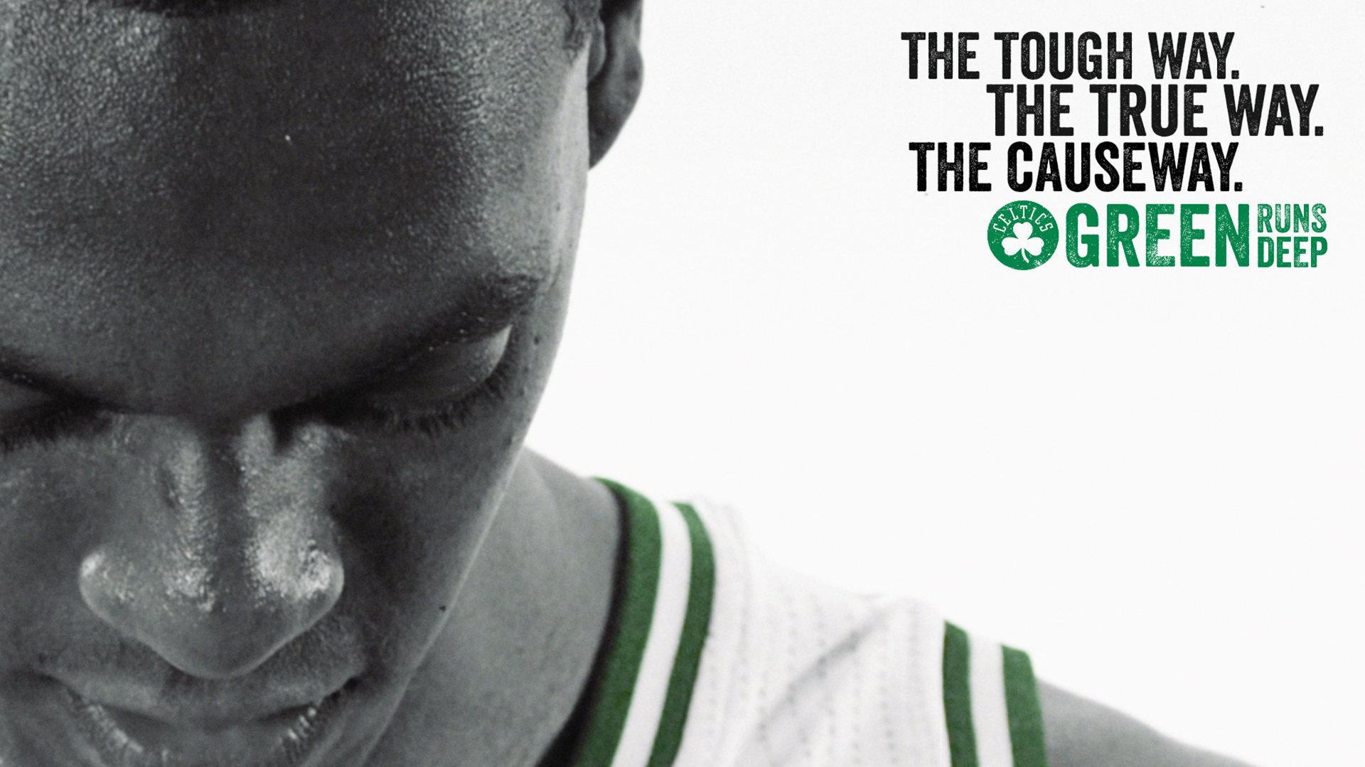
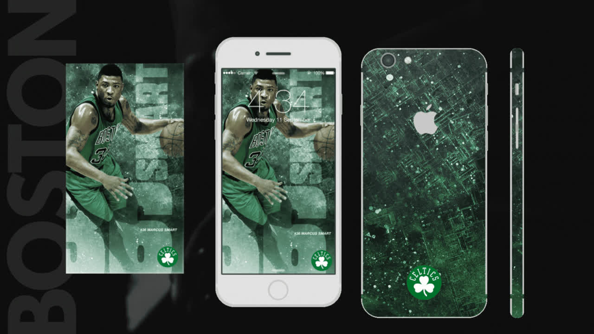
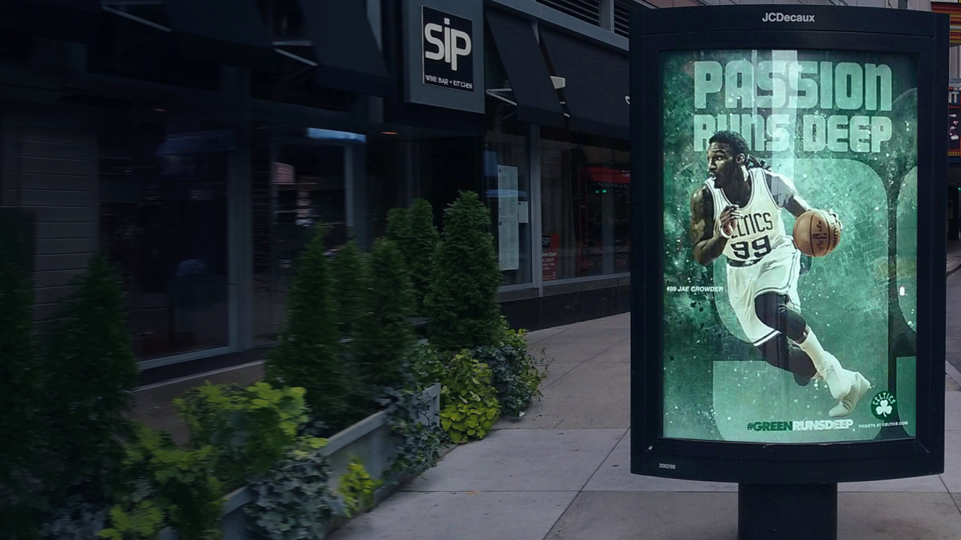
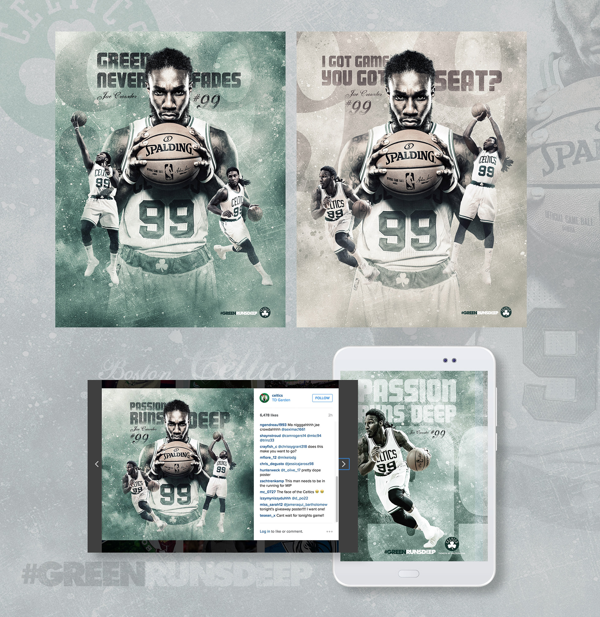
The Boston Celtics stand as one of the NBA's most storied franchises, with a legacy built on championships, legendary players, and a fan base deeply rooted in the gritty, hard-working ethos of New England. The "Celtics 360 Campaign" was developed as a comprehensive, multi-channel ecosystem designed to bring the franchise's legendary spirit to life for a new era. Our strategy was to center the brand around a single, unifying concept: The Grit and Glory. This theme celebrated the team's undeniably tough, hard-nosed identity and tied it directly to their championship success. This campaign generated a tremendous buzz among Celtics fans in New England as well as natinally increasing brand engagement and the desired marketing metrics in three continuous seasons.